Meaningful Oversight
Approval buttons aren't oversight. What real, decision-grade human review looks like.
Oversight ≠ approval UI
I want to drive this point home with a hammer. Approval is a UI pattern. Oversight is a system property.
You can have approval everywhere and oversight nowhere. The signs:
- The same person approves everything.
- Approvals happen in seconds, on a phone, between meetings.
- There's no audit trail of why something was approved.
- "Reject" is a worse user experience than "approve."
What meaningful oversight looks like
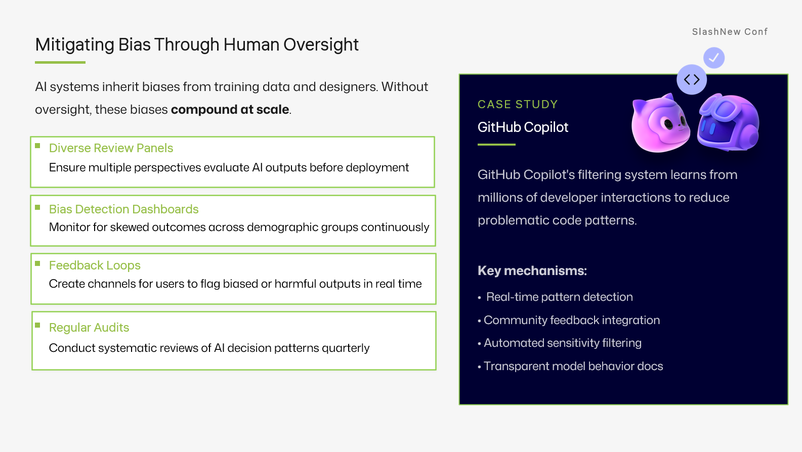
- Diversity. More than one person can review. Reviewers rotate.
- Context. Reviewers see the inputs, the plan, the model's reasoning and the proposed action, together.
- Time. There's a reasonable SLA, not "instant or it blocks production."
- Symmetry. Rejecting is as easy as approving, and rejection produces a useful artefact (a comment, a label, a follow-up issue).
- Audit. Every decision is queryable months later.
The GitHub-shaped version
GitHub gives you most of this for free: pull requests, required reviewers, branch protections, audit logs, CODEOWNERS. If your AI system is producing changes that live outside that system, you have rebuilt, badly, what you already had.
Whenever possible, make the agent's output a PR, and let your existing review culture do the work.